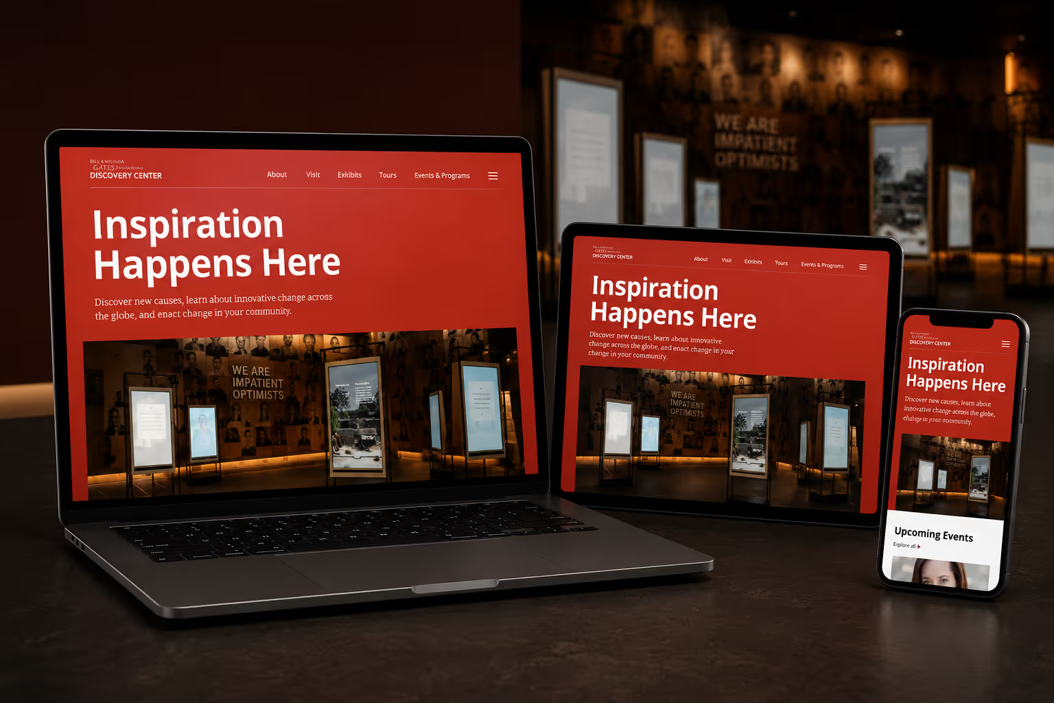
The Gates Discovery Center Museum needed a more flexible digital experience that could better support content discovery, evolving visitor needs, and editorial storytelling.
At the same time, the Gates Foundation had recently redesigned its digital brand identity, requiring the museum’s sub-brand to evolve as part of the website redesign. The updated identity needed to align more closely with the new Gates Foundation design system while still maintaining a distinct presence and remaining visually connected to the existing physical museum experience.
To address both the experience and system-level challenges, I proactively partnered with engineering to introduce the company’s first percentage based responsive framework, establishing scalable typography, spacing, and component behaviors that created a more consistent and adaptable experience across devices.
Experience & Systems Tension
The organization lacked a scalable design system, leading to fragmented microsites, inconsistent experiences across devices, and growing complexity for both visitors and internal teams to navigate and maintain. The existing experience made content discovery, navigation, and editorial storytelling increasingly difficult to scale.
Brand Tension
The museum wanted a bolder digital identity that better reflected its mission while still aligning with the broader Gates Foundation design system, which emphasized a more restrained black-and-white visual language.
Physical/Digital Tension
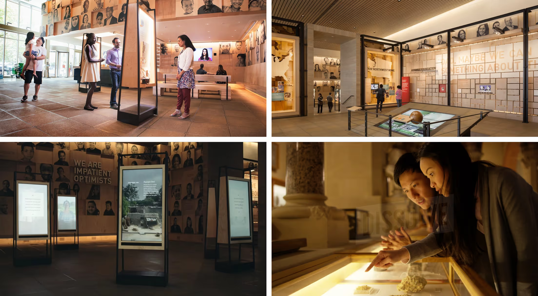
Much of the museum’s physical signage and wayfinding already existed, requiring the digital redesign to evolve the brand without creating a disconnect between the online and in-person experience.
I led the responsive systems strategy and contributed to the broader UX and digital brand redesign for the Gates Discovery Center Museum, partnering closely with design, engineering, and stakeholders to create a more scalable and cohesive digital experience.
Responsibilities
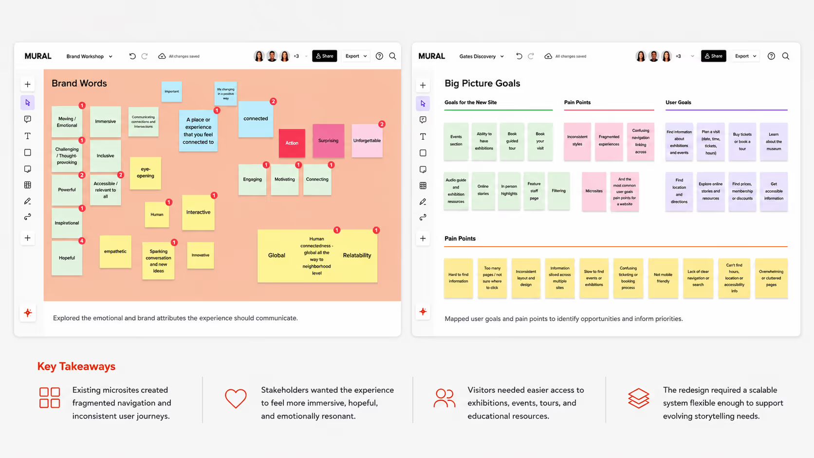
To align product, brand, and experience goals I facilitated workshops with stakeholders to identify user paint points, define success metrics, and establish the emotional direction of the redesigned museum experience.
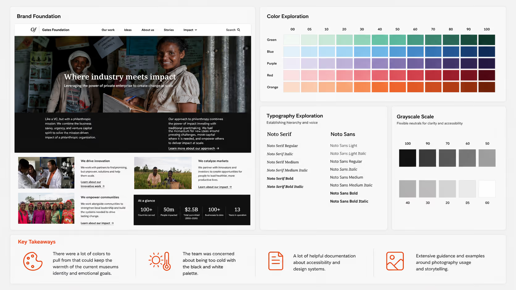
We explored the Gates Foundation design system to better understand its visual language, accessibility principles, photography guidance, and editorial tone. The goal was to evolve the Discovery Center identity in a way that felt aligned with the broader Gates ecosystem while preserving the warmth and emotional qualities already associated with the museum experience.
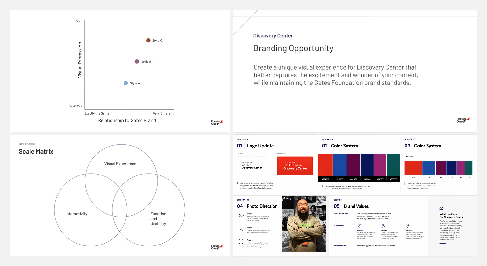
We explored how visual identity, motion, storytelling, and interaction design could work together as a cohesive product experience rather than treating branding as a separate visual exercise. Strategic frameworks helped stakeholders evaluate concepts based on emotional tone, usability, and differentiation instead of subjective visual preference. The resulting directions balanced boldness and immersion while remaining connected to both the Gates Foundation ecosystem and the museum’s existing physical environment.
We explored how brand expression, content hierarchy, and interaction patterns could scale consistently across XL, desktop, tablet, and mobile environments.
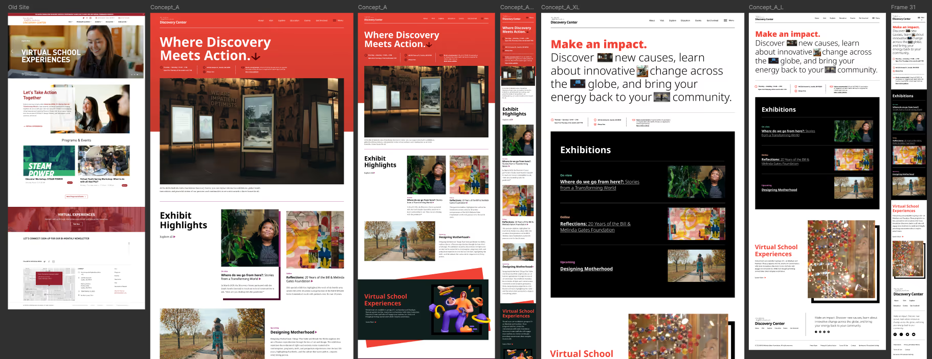
The first concept evolved toward the updated Gates Foundation identity while maintaining continuity with the museum’s existing physical experience. We used the Foundation’s red palette as a bridge from the warmer orange tones already present throughout the museum’s signage and printed materials.
To create a more immersive experience, we introduced motion and interaction through video driven hero moments, interactive exhibit hover states, and subtle autoplay media throughout the page.
The second concept explored a more restrained black and white visual system inspired by the primary Gates Foundation site. To preserve the warmth and energy of the museum experience within a minimal palette, we experimented with interactive image and video treatments embedded directly into editorial layouts.Across both concepts, we evaluated how storytelling patterns and interactions adapted responsively from large desktop to mobile environments while preserving hierarchy, usability, and engagement.
Going into the project, I wanted to rethink how responsive systems could better support modern screen sizes instead of relying on rigid breakpoint-based layouts. Many desktop experiences only utilized a fraction of available screen space, limiting opportunities for stronger storytelling, clearer hierarchy, and more immersive content experiences.
Before the project officially kicked off, I proactively partnered with engineering to explore a more adaptive responsive framework from the start rather than retrofitting responsiveness later in the process. Together, we researched how large-scale editorial and institutional platforms approached linear scaling, proportional spacing, and responsive containment across expansive breakpoints.
References including Chamber of Commerce, The Futur, Bainat Museum, and MAMA helped inform a percentage-based responsive framework where typography, spacing, imagery, and component behaviors scaled proportionally together instead of shifting abruptly between breakpoints. The result was a more fluid system that allowed editorial layouts and interaction patterns to remain impactful across XL, desktop, tablet, and mobile experiences.
At the time, we had not yet determined whether the framework would rely primarily on percentage based scaling, a combination of percentages and relative units, or another responsive approach. This early exploration helped define how typography, spacing, and components could adapt fluidly across screen sizes before development began.
Component behaviors and responsive patterns were also informed by the underlying content model, ensuring the system could flexibly support a wide range of editorial and exhibition needs.
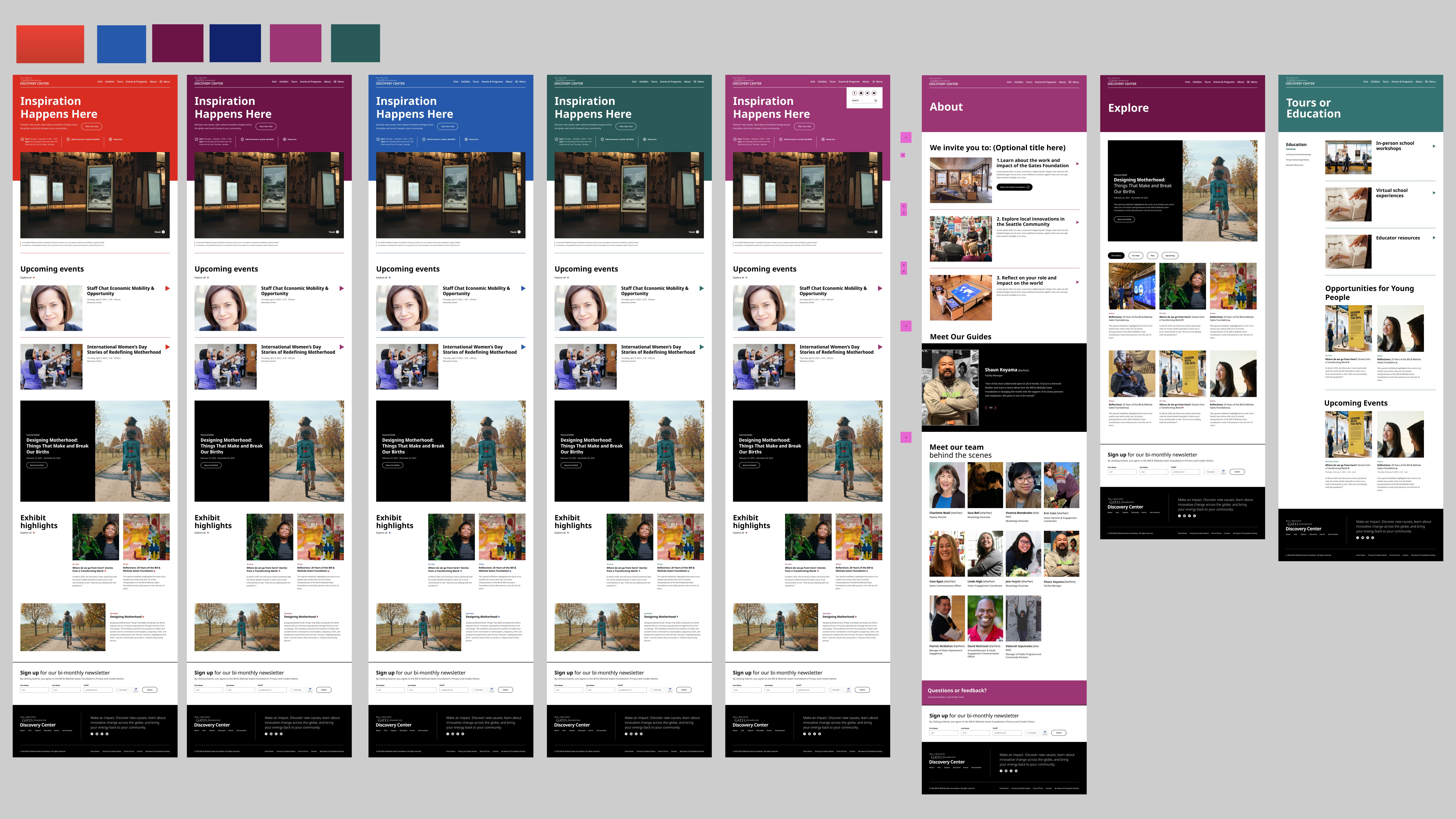
The client initially gravitated toward a bold concept that heavily leveraged the Gates Foundation’s bright red brand color. However, the team was concerned the intensity could become overwhelming across editorial content and large scale page experiences over time.
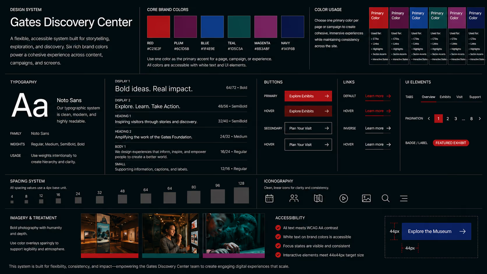
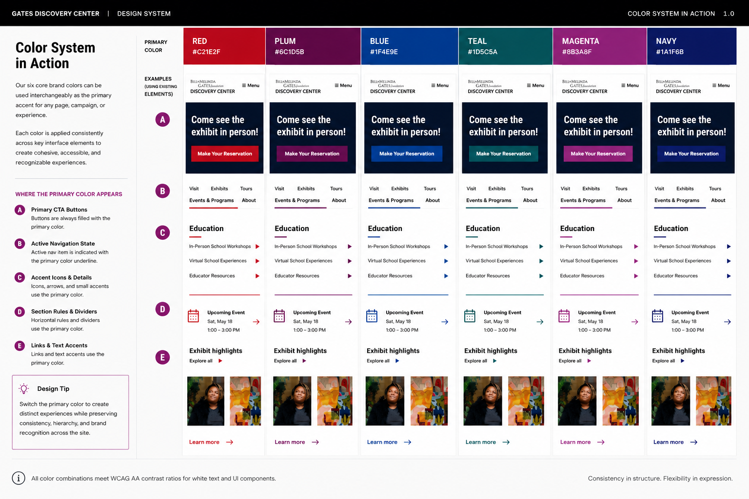
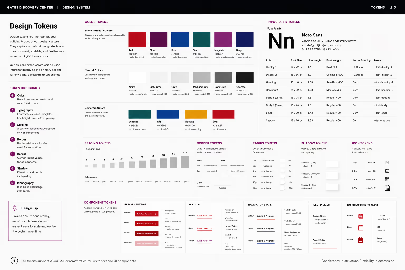
To create greater flexibility while preserving the warmth and energy of the brand, we developed a flexible color system built from six core colors within the Gates Foundation palette. Individual pages and campaigns could adopt one of the six colors as a primary accent while maintaining consistency across the broader site experience.
We also established accessibility and usage guidelines to ensure interchangeable color system could scale consistently across editorial layouts, calls to action, navigation, and supporting interface elements.
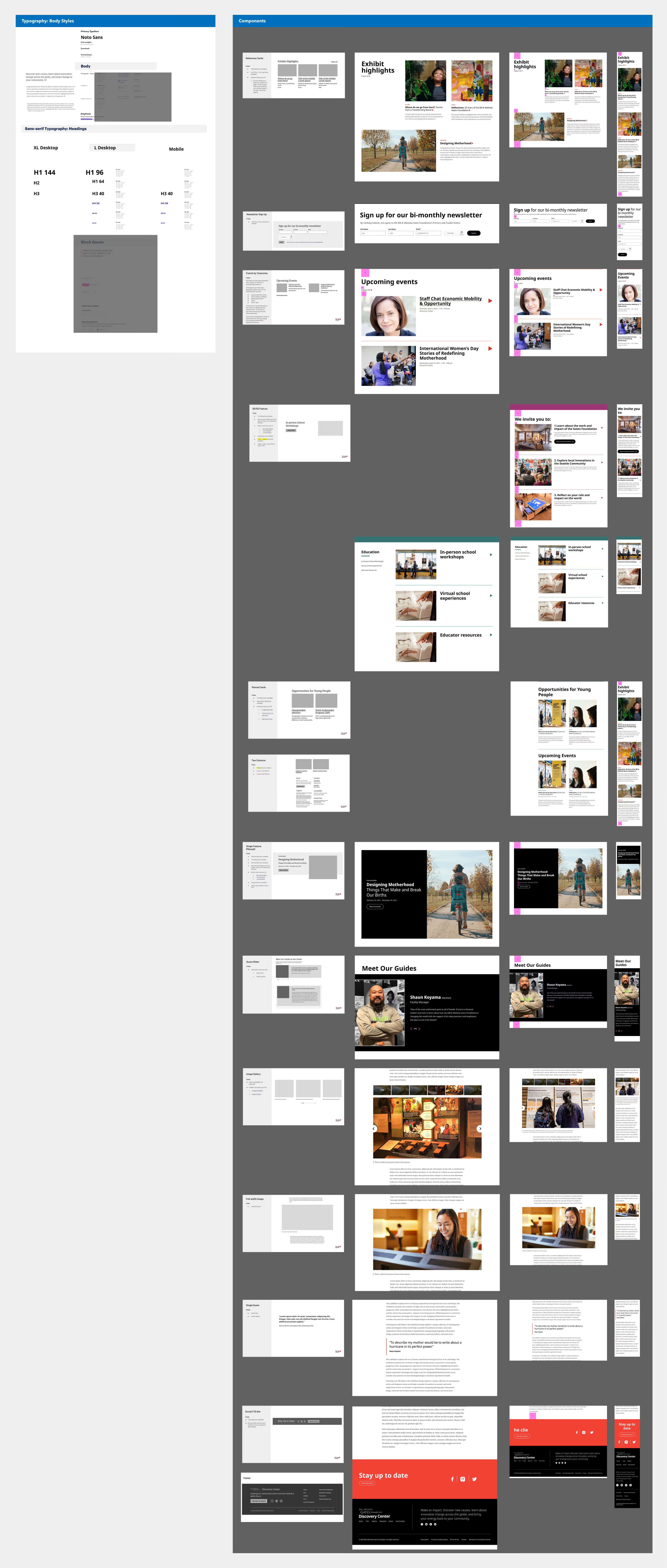
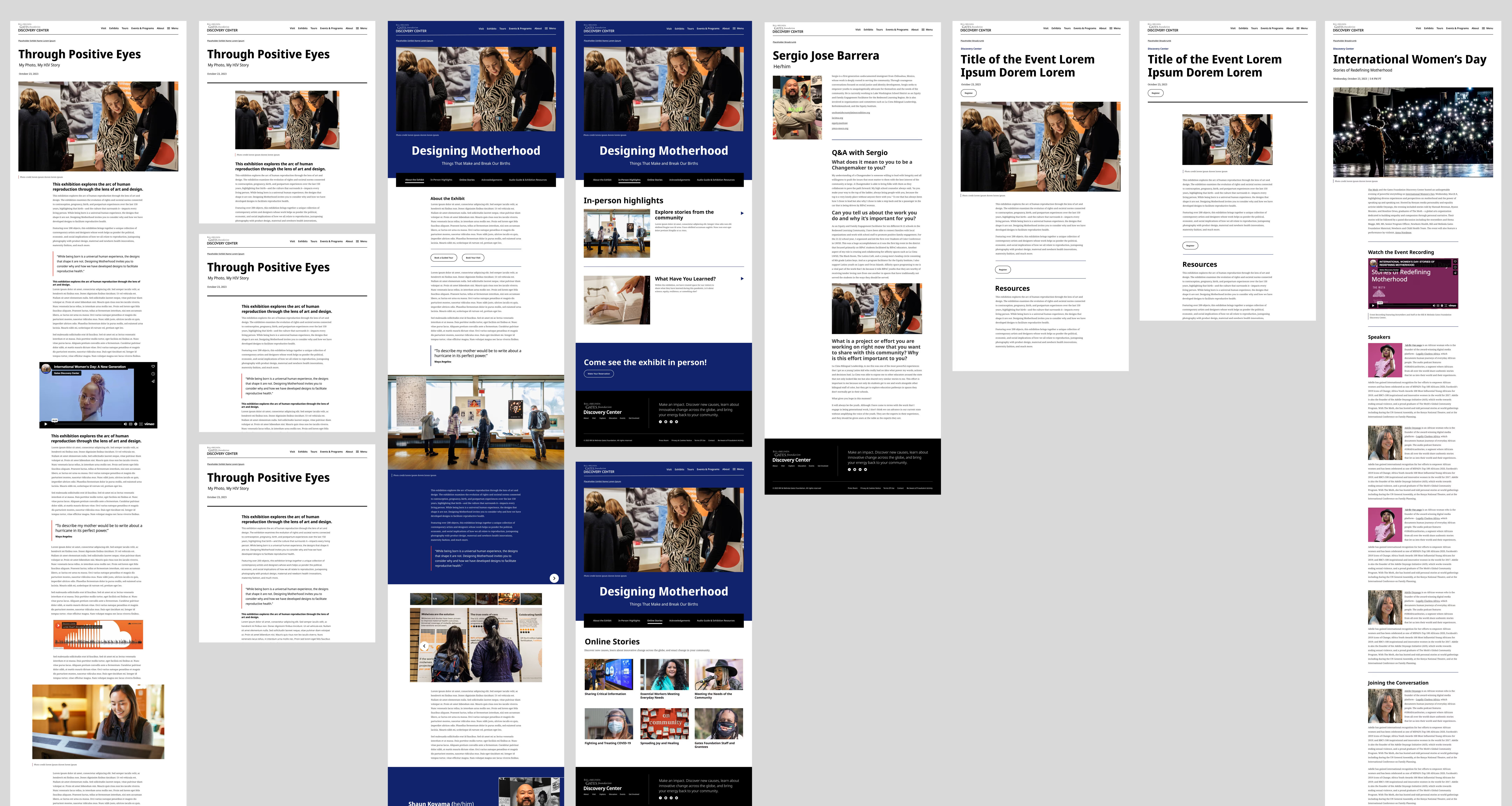
To reduce the need for standalone microsites, we designed a flexible editorial system that allowed the museum team to create immersive exhibition and campaign experiences directly within the primary website.
The system supported a wide range of storytelling needs, including pull quotes, full color sections, image and video modules, exhibition navigation, and modular content layouts.
By replacing fragmented microsites with reusable patterns, the experience remained more cohesive across the broader digital ecosystem while still giving the team flexibility to tailor each campaign and exhibition to its unique audience and story.
As the redesign neared completion, stakeholders repeatedly requested smaller typography and reduced spacing to fit more content above the fold. While the design team explored multiple rounds of refinement, further reductions began compromising the intended hierarchy, readability, and broader goal of creating a modern and immersive experience.
The breakthrough came after discovering that one of the primary stakeholders was reviewing designs on an ultra wide 21:9 monitor, significantly changing how much content appeared above the fold compared to standard screen sizes. After recreating the experience within that viewport, we were able to clearly identify the disconnect between stakeholder expectations and the responsive layouts we had designed.
Using analytics data, we demonstrated that the majority of visitors viewed the experience within more standard device dimensions. This helped realign conversations around user behavior instead of individual viewing preferences and ultimately led to approval of the final direction.
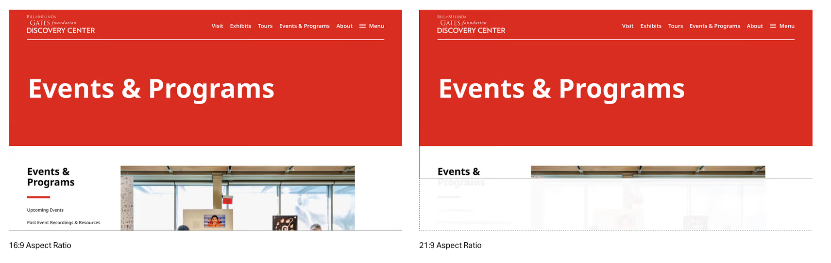
One of the biggest takeaways from this redesign was how quickly typography and spacing can become oversized when scaling proportionally across large screen environments. Through experimentation, we found the most effective approach combined flexible container widths with responsive spacing adjustments rather than relying entirely on fluid scaling.
The project reinforced that responsive systems work best when they balance flexibility with intentional constraints. Larger desktop experiences benefited from proportional scaling, while tablet and mobile environments required more traditional spacing and layout behaviors to maintain readability, hierarchy, and usability.
These learnings directly influenced how I approached responsive systems in later projects, including this portfolio site, which I built using viewport based scaling (vw) as an additional experiment in responsive behavior. While the approach created stronger continuity across larger screen sizes, it also highlighted how aggressively proportional systems can shrink on tablet and mobile devices, reinforcing the importance of balancing fluid scaling with more fixed responsive structures where usability benefits most.
The redesign created a more cohesive and adaptable digital ecosystem for the Gates Discovery Center Museum, improving content discovery, editorial storytelling, and responsive consistency across devices.
By replacing fragmented microsites with reusable editorial systems, the platform became more flexible for internal teams to manage while creating more unified visitor experiences across campaigns, exhibitions, and educational content.
