
The AARP Livability Index redesign focused on improving a data-rich platform that helps users evaluate how communities support quality of life across factors like housing, transportation, environment, health, and opportunity. The experience needed to support a wide range of users while making complex geographic and demographic data easier to explore, compare, and understand through clearer hierarchy, responsive systems, and more unified navigation.
To align the experience around clearer user and organizational goals, we facilitated a series of workshops with internal AARP stakeholders focused on defining site goals, target audiences, key performance indicators, design preferences, and technological requirements. These sessions helped establish a shared vision for the platform as both a practical decision-making tool and a broader educational resource around livability, housing, aging, and community policy.
Key priorities included helping users make more informed housing decisions, increasing transparency around livability scoring and methodology, connecting users to additional AARP resources, and positioning the platform as a trusted destination for livability research and advocacy.
Primary audiences included consumers, policymakers, media organizations, and researchers focused on aging and community development.
We conducted user interviews with consumers to better understand how people evaluate communities and which factors most influence their perception of livability. Research revealed that users struggled to compare locations, understand geographic boundaries, and quickly access relevant insights due to fragmented navigation and disconnected datasets.
The redesign focused on consolidating fragmented functionality into a more centralized and intuitive search experience. We explored ways to simplify navigation, improve information hierarchy, and make complex data feel more understandable through responsive layouts, clearer visual systems, and scalable interaction patterns.
A major focus was helping users orient themselves spatially and contextually through improved map interactions, geographic boundaries, and more approachable data visualization patterns. The visual system incorporated custom illustrations, photography, and editorial layouts to make dense civic and demographic data feel more approachable and human-centered.
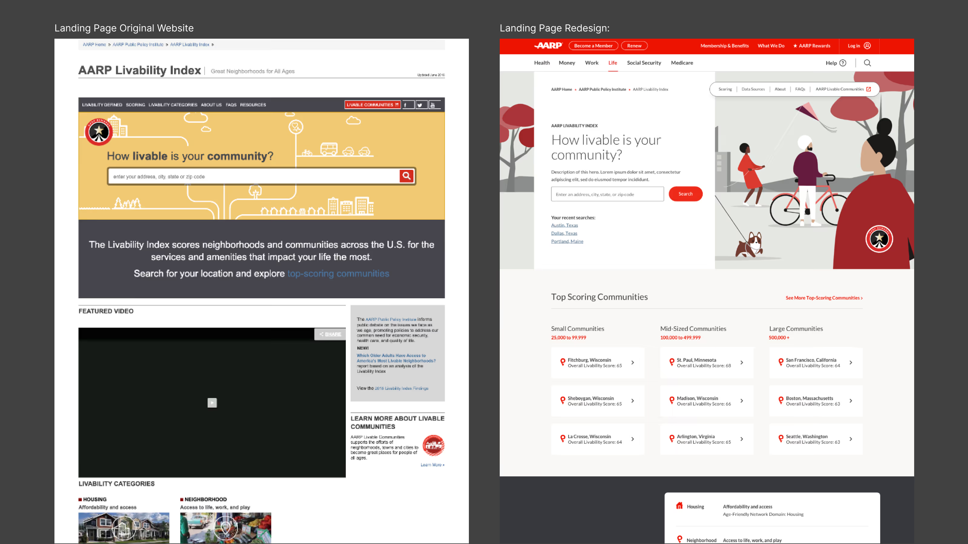
We redesigned the results experience to shift away from a map-first layout and instead surface more of the platform’s underlying data, comparisons, and scoring insights directly within the dashboard. Research revealed that users often struggled to understand the interface, didn’t realize how much information could be filtered or compared, and lacked context around what the scores actually meant in isolation.
The redesign focused on improving information hierarchy, comparative analysis, and data clarity by restructuring how category scores, scoring methodology, and visualizations were presented. We introduced a more scan-friendly layout that helped users quickly understand what information was available, how different metrics related to one another, and how to compare multiple data points side-by-side without losing context.
We also ensured these interactions and data relationships scaled consistently across both desktop and mobile experiences, preserving functionality while improving readability and usability across devices.
.avif)
Usability testing throughout the project helped validate the effectiveness of the redesigned search experience and overall information architecture. Feedback after launch showed users responded positively to the more unified experience, improved navigation clarity, and the ability to better understand searched locations through enhanced map boundaries and contextual information. a broader educational resource around livability, housing, aging, and community policy.
Following the redesign, we conducted a series of unmoderated usability studies through UserZoom Go to evaluate the effectiveness of the updated experience. Testing helped identify both successful interaction patterns and areas requiring further refinement, informing ongoing iterations across navigation, hierarchy, and discoverability.
The project reinforced the importance of iterative testing, collaborative discovery, and designing data-heavy experiences that balance complexity with clarity.
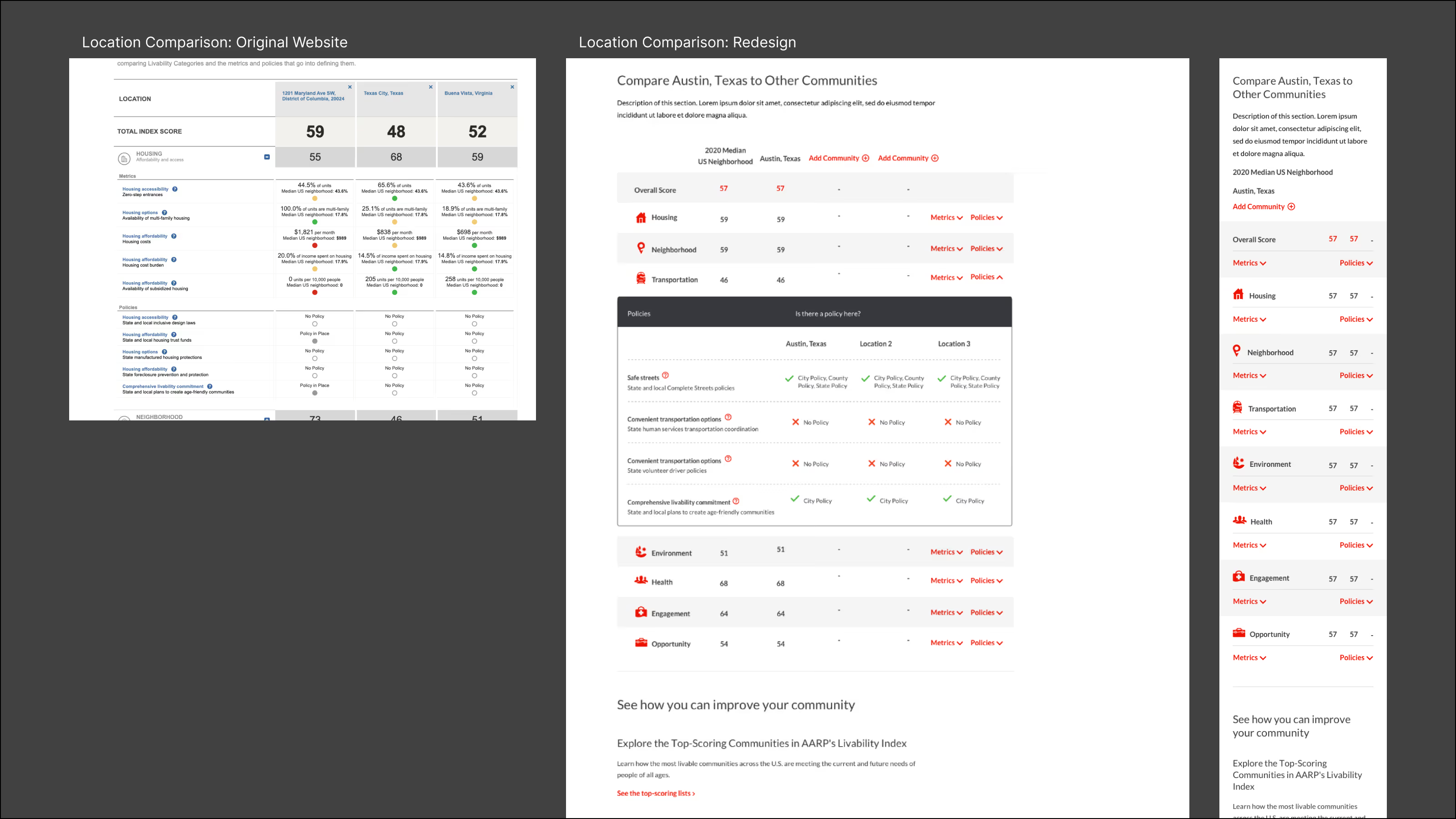
The redesign helped transform overlooked tools and disconnected datasets into a more unified and understandable platform experience. By improving information hierarchy, comparison workflows, and geographic context, the experience made complex livability data easier to explore and interpret across a wide range of users. The project also established scalable responsive systems that preserved dense data interactions and usability across both desktop and mobile experiences, creating a stronger foundation for future platform enhancements and ongoing iteration.
